Insurely Portfolio
Project 1: Insurance Overview
Note: Client Names and Logos have been removed
What I did:
Worked directly with multiple stakeholders at the client company, and internally to refine and adjust a brand new product - insurance overview with a policy comparison to perform in a new market. This was done multiple ways throughout the length of the project;
Referencing previous studies in the French market that we had done to see user needs and concerns about data usage and using that data to refine and combine 2 separate products (an overview, and a comparison)
Worked closely with developers, product managers, and other stakeholders to refine what we could do versus where we wanted the product to evolve
Developed and ran multiple User Studies testing the efficacy of different product directions and improvements
Constantly monitored live usage data to inform product usage and possible areas of improvement
Ran multiple cross disciplinary workshops focusing on exploring new ideas in the product throughout it’s development - using insights from interviews, live users, and internal stakeholders
Notes of the designs
This work was created with close collaboration with other designers, developers, and other stakeholders. Using and building off of an internal Design System which I helped maintain and grow
Version 1
Notes on version 1:
This first version was created by piecing together our at the time live versions of modules:
A Collection Module
An Overview Module
And a Comparison Module
The first version was created with an empty state version of the overview.
During development I experimented with multiple different styles of empty states including a few different animations
Ultimately all of the empty state ideas were determined to be too complicated to build using codebase, and too time consuming to finish the design
The initial version of the connection method select screen used two cards which I previously designed for a checkout form, to highlight details and needs on the 2 possible types of connection
This was our first time have a screen which allowed for 2 different connection types
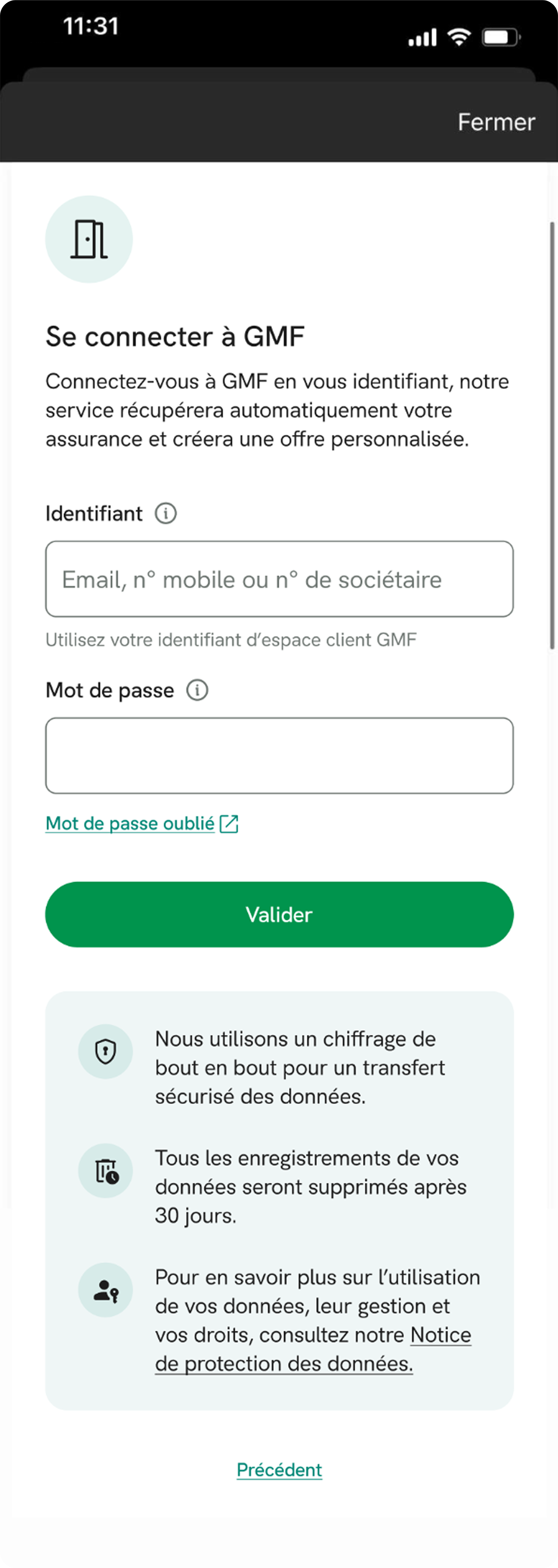
The initial version of the login page had 2 additions from the at the time standard
1. A GDPR description explaining the data usage guidelines
We heard repeated concerns in multiple user studies over data usage and storage, so the disclaimer was added to relax consumers
2. A description was added above the username and password
Previously the focus had been on SSO (single sign on clients) so adding more descriptors was needed to help user add the correct information
After the collection we started the first version with a simple overview, viewing the deatils on an applicable home policies would offer the choice to compare
This was done because there were 2 different goals with the product initially:
1. Have consumers collect their insurance
2. Compare and sell insurance policies
Redesign
Why the redesign?
The redesign came into place after multiple smaller updates slowly tested well in other client flows who were more willing to experiment
We used the live consumer data as well as findings from multiple user studies that I ran to convince the client that doing a total overhaul of the design was necessary and would benefit the product and their users
The user studies and multiple internal workshops showed us where to focus our time and design efforts which lead to these changes
One of the first hidden improvements we did was to get rid of the empty state overview, launching straight into company selection if you had not previously collected
The headers throughout the flow were updated to work better in different use cases (in apps or in websites)
We also added a “Don’t See Your Insurance" section to the bottom to help track consumers who had other insurance companies, better tracking drop offs
After various different versions of connection selection, it was determined by our client that we needed to retain specific legal information.
We were able to convince them to allow us to hide information until an option was selected, and had a pre selected option in order to drive traffic to the option where we had better capabilities of data collection at the time
Multiple rounds of user interviews, and user testing with French consumers showed a general distrust in sharing personal information - something which we expected but were surprised by the extent of it when the product went live
This lead to us adding security and data usage information in a clear and obvious place
After adding the security details we noticed a continuous upwards improvement on sign in attempts
We noticed users uploaded incorrect file types (our system only accepted a single file type) so our team decided to put explicit supported and not supported document examples.
This change greatly reduced the quantity of incorrect uploads
One of the key features we tested and built in during the products early life was the ability to go directly to a coverage comparison from the Overview, on eligible insurance policies
I designed the quick comparison card to highlight comparable policies, but still maintain the ability to see insurance details
When multiple insurances could be compared their we pushed to the top of the list to ensure that if a policy was comparable one was always visible at the the time of loading
Testing this with users immediately solved any confusion issues over what to do next, and had a noticeable increase on conversion when it went live
Project 2: Feedback Module
Project timeline: 1 week of design
What I did:
Worked closely with developers leveraging our live design system to design and build a feedback module that could be placed on a fake loading screen to gather ENPS scores and similar data on users
I designed configurable timers that allowed us to use this feedback module across multiple different products and clients as soon as it was live
Project 3: Comparison Module
(Coming soon, Work In Progress)


